Author Website Inside Tour: Patrick Hurley
• This article contains affiliate links •
Today I’m taking you behind the scenes of one of my author website projects to show you some of the decisions we made about strategy, content, tech, and design.
Patrick Hurley is emeritus professor of philosophy at the University of San Diego. Having authored a series of books on logic that have taught more than a million students, his latest publication is a philosophical examination of the phenomenon of religion against a broad swath of history.
Professor Hurley came to me to create his first ever author website, specifically to focus on and promote this new book.
I created a video tour to show you his website, the author content we placed on each page, and why:
Resources and tips mentioned in the video
Save 10% off your first subscription of a Squarespace website by using the code PAULINE10
Mood boards for Patrick Hurley’s Author Website
Early in every custom author website project, I create a mood board to make sure our intended visual elements work well together. The mood board is not a mockup of the home page, nor does it try to include everything that will eventually go on the website, but it’s an important guide to overall design direction.
Here’s a peek at parts of the mood board for Prof. Hurley’s site. In this case, the book covers and small images were provided by the client; the larger scenery photos are free stock images, sourced by me to represent the subject matter and harmonize with the book cover.
(You’ll be pretty lucky if you find free photos that look this good, when placed alongside your book. I made edits to the colors and quality of light for each picture, to get this beautifully harmonious result.)
Author Website Page Structure
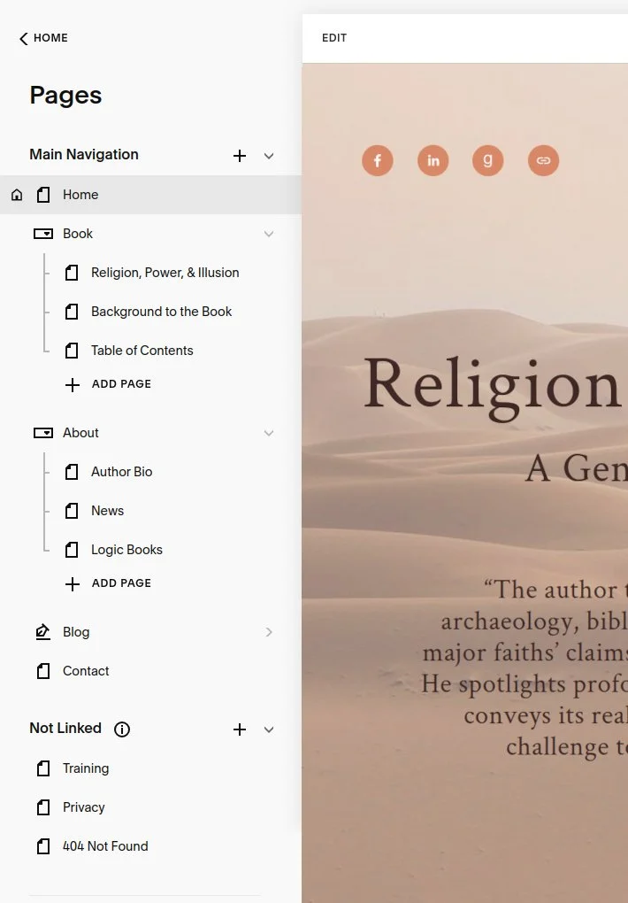
Here’s Prof. Hurley’s website page structure, seen from inside Squarespace. You’ll notice each of the pages in the Main Navigation — these are the ones you can click on, at the top of Patrick’s website — plus additional pages in the Not Linked section. These include the Privacy policy, a custom “404 Not Found” page, and a secret page that’s very popular with my clients!
The majority of my author clients want to make at least basic updates to their website themselves, so at the end of most projects I create a page of handy training links, including short reminder videos for how to make future edits on their own.
Although I do provide à la carte support services for past website clients, I don’t sell (let alone require) retainer packages, and I love empowering my authors to make simple website updates on their own.
So this is another way that I take care of my clients and offer them not just a customized website, but personalized training resources too.
If you’re working with a website designer and want to be able to make edits yourself after they hand the site over to you, it’s crucial that you stress the importance of this early on, so they don’t include reams of custom code that you’ll never be able to navigate. This is one of the strengths of Squarespace - websites can look excellent without masses of clever coding.
Integration with MailerLite for author newsletter sign-ups
And here’s a look at the footer of the website, as seen inside Squarespace. The little email sign up form (First Name field, Email field, and Subscribe button) are powered by MailerLite. When a website visitor fills out this form, their details are passed across to Patrick’s MailerLite account so that he can send future news to them.
In Squarespace, to get this working, we add a Code block, and paste in the snippet of code provided by MailerLite:
I loved how Professor Hurley’s website turned out because it’s not only beautiful, it’s professional, credible, and highly functional too.
Please check out the live site and if you’d like something similar for your book, I’d love to chat.
•
Would you like me to design and build your Squarespace author website?
Prefer not to spend your precious writing time and energy navigating design issues like this, let alone making the tech pieces all work?
As a professional specializing in strategic websites for authors and solopreneurs with books, I’m an expert in the features you need for a website that connects with your readers and gets business results. If you’d like niche expertise, top quality design, and your technical headaches solved, consider hiring me.
After careful preparation together, I’ll design, build and launch your site in just 2 weeks. Learn more, and then schedule a complimentary consultation.


