Best Squarespace Author Websites
• This article contains affiliate links •
As a Squarespace designer who helps authors and coaches create beautiful, high-impact websites, I love to research industry trends. This includes browsing plenty of sites belonging to authors from different genres.
Many author websites, sadly, do not present the book or the author in a professional, contemporary way. Far too many are outdated, cluttered, or not mobile responsive.
So it’s a pleasure when I come across an author website that combines an attractive viewing experience with clear business focus.
I’ve gathered 27 of the best author websites built on the Squarespace platform.
Together, they’re a great resource for Squarespace design inspiration and examples of strong Squarespace templates for authors. They also provide general author website inspiration, and business clues for how your website can work harder as part of your author platform.
Related: Join my small group program, where you’ll build and launch your new Squarespace website in 3 weeks in a supportive and collaborative online cohort.
•
Nonfiction: Author websites built with Squarespace
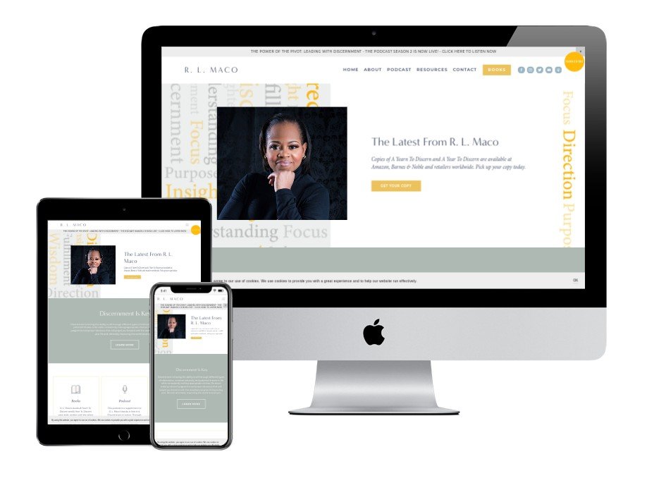

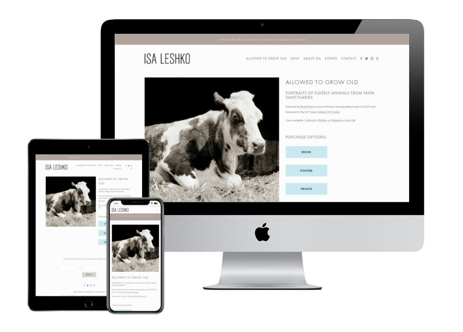
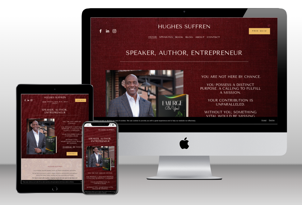
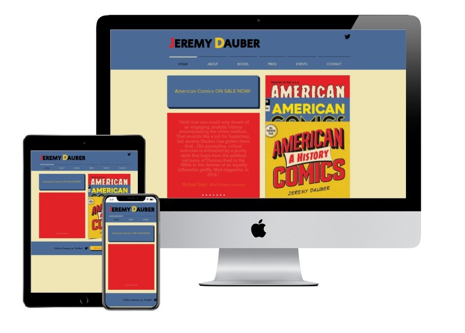
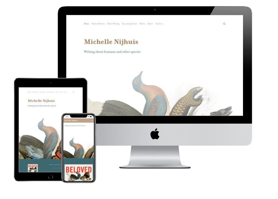
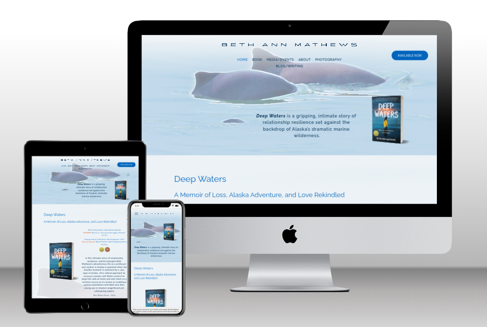
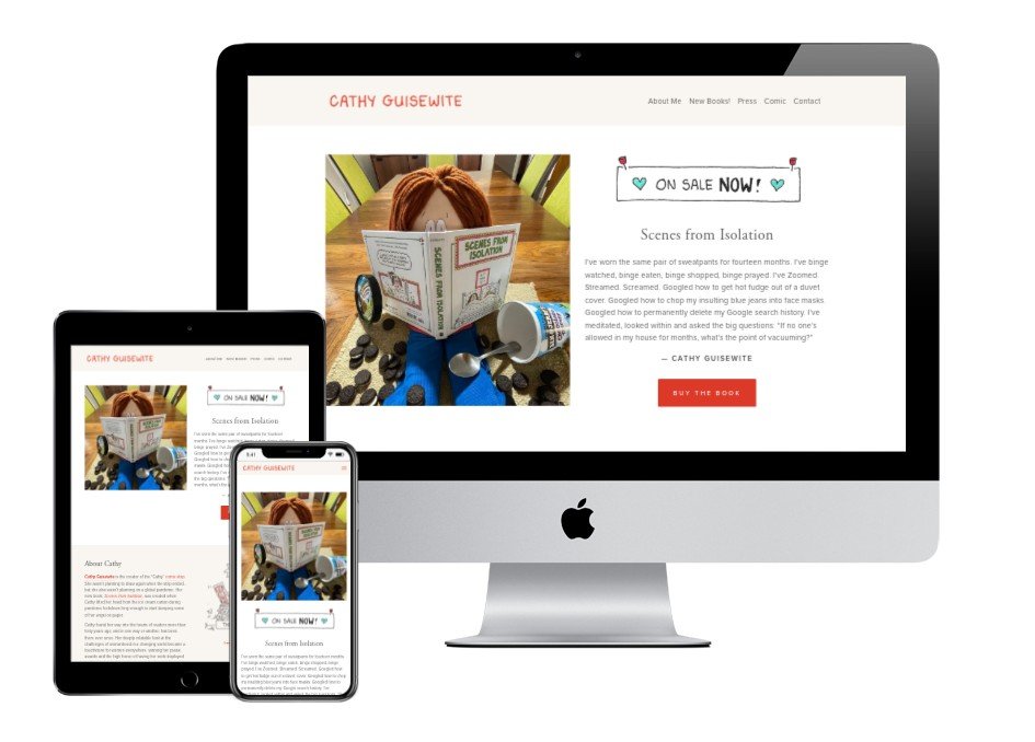
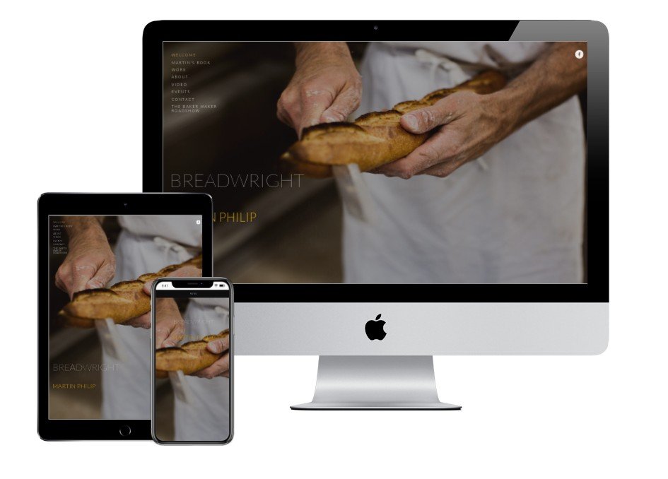

Nonfiction: Author website credits
BreadWright by AuthorClicks
Jonathan Bender by AuthorClicks
Fiction: Author websites built with Squarespace
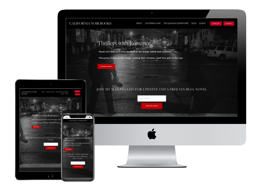

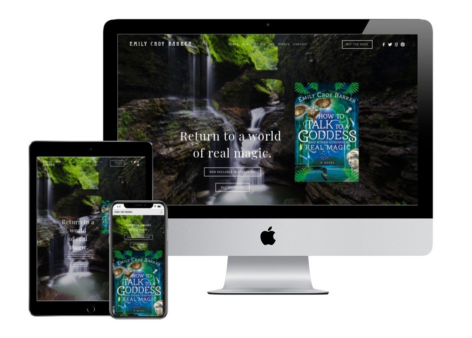

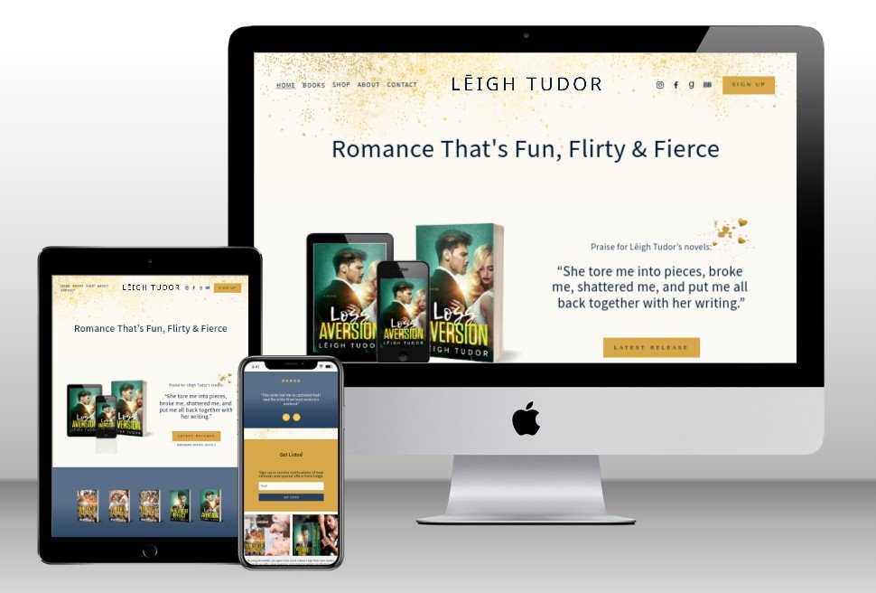
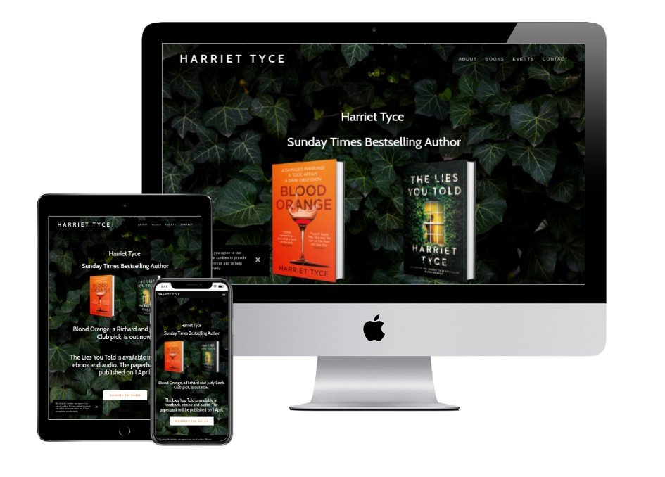
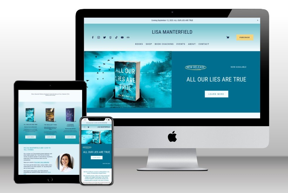
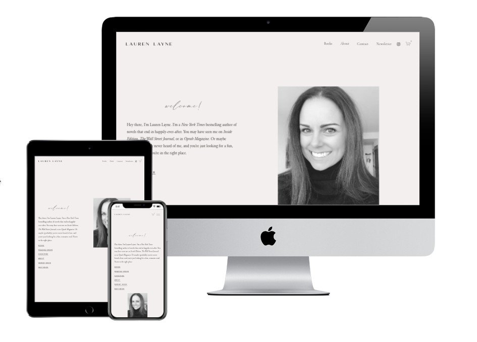


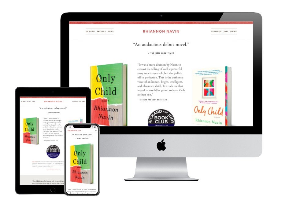

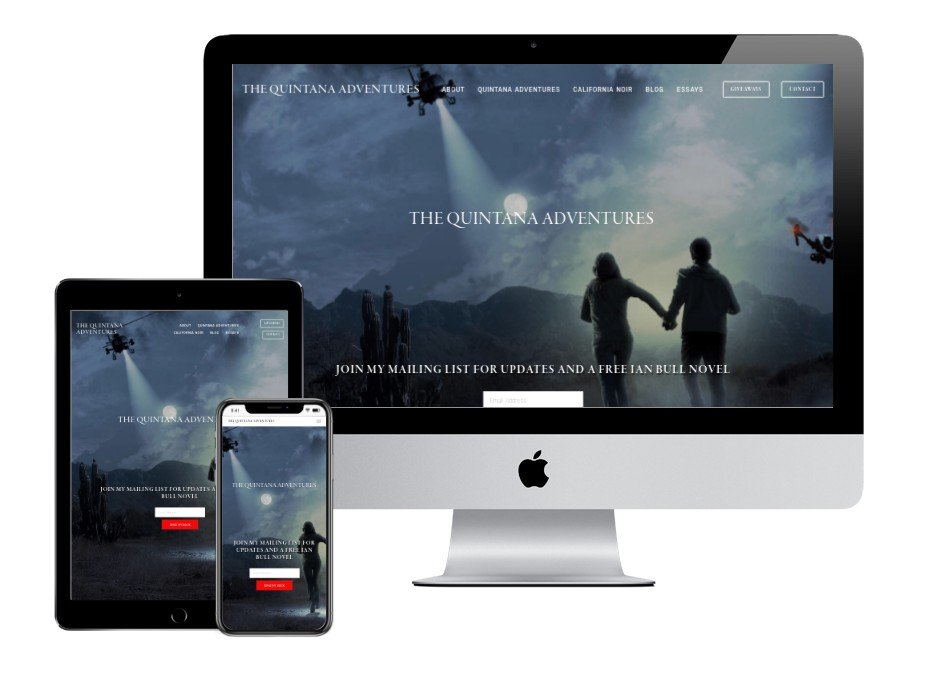
Fiction: Author website credits
Lauren Layne using a template by The Coast Kit
Jennifer Niven by ?
Jennifer Weiner by ?
Poetry, Memoir, Younger Readers: Author websites built with Squarespace
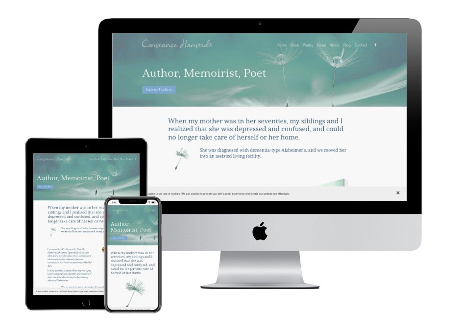
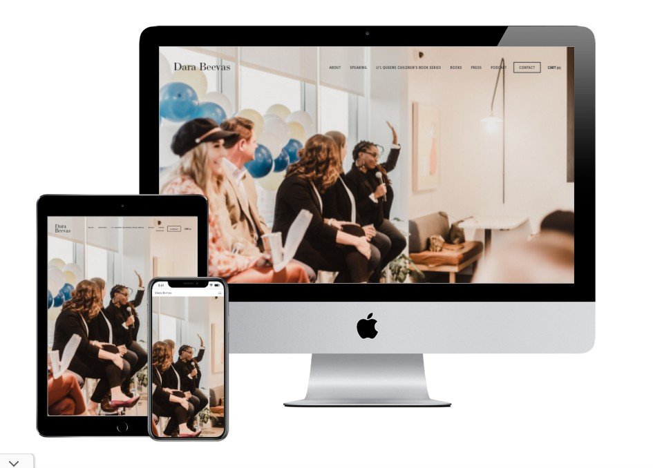

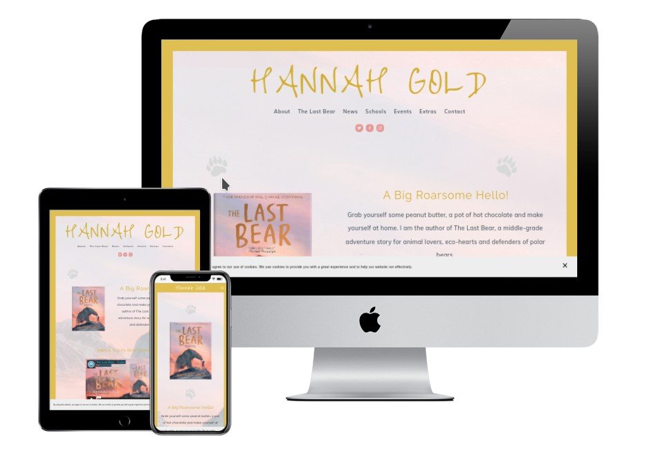
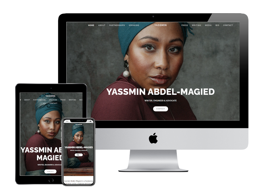
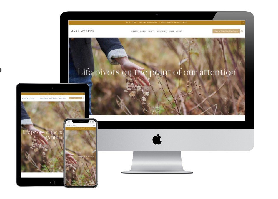

Poetry, Memoir, Younger Readers: Author website credits
What do these best Squarespace author websites have in common?
Your author website is a creative, personal showcase for your work, but there are certain elements that show up repeatedly in these best author websites. Look for:
Overall focus on the visitor’s experience. This means content is succinct and useful, not a vanity storage area for everything the author has ever produced.
Quality, large, clear images that are on message for the author’s brand.
Professional-quality author headshot(s).
Large, proud book cover images. Ideally, these are in “3D” if the book is available in print as well as electronic form.
A clear Call to Action, to persuade the visitor to do what is most important to the author.
Prominent links to buy books, ideally as buttons instead of text. Book cover images linked up too, so they lead somewhere useful.
A way to join the author’s email list, and/or functional social media links.
Dates, news and other time-sensitive items are current or marked with the year, to avoid confusion.
If there is a blog, posts are recent and useful, not personal musings from years ago.
Clear navigation structure (menu items), using short, easy words like Books, About, Contact.
Basic Search Engine Optimization is in place. This includes keywords, page descriptions, image “alt” tags, site load speed, and mobile responsive design.
Legal requirements met, for example by showing a Privacy Policy link on every page. Copyright asserted with the © symbol.
12 things to improve, even in these best author websites!
All the author sites shown above are strong, effective, and appealing to the visitor. However, even among these best example Squarespace websites, I noticed some details that had been overlooked. If you’ve set your sights on a best-of-breed author website, look out for:
Your genre (and/or who will enjoy your books) is not immediately clear as soon as the home page loads. Remember, strangers will come to your website and you need them to know what you do, fast.
Book covers shown as flat images, instead of “real” books. Here’s a free tool I love to make 3D book pictures and here are instructions on how to do it.
Links to external websites (for example, your Amazon page or website designer’s credit) not opening in a new tab. The risk here is your visitor will click away and not come back.
A generic favicon for the tiny icon shown in the browser tab. Leaving the default generic Squarespace favicon in place is a missed branding opportunity. It often reveals a DIY website slip!
Content announcing a forthcoming book on sale, where the publication date is more than a few months ago. You should update your website in the weeks after every fresh book launch.
Pages that are not full-width. Modern website design typically uses the whole screen, so a box with a border looks a little dated.
Wording that invites your visitor to “join mailing list” or “join newsletter” instead of the benefits or perks of doing so. Very few of us want yet more email! Your reader wants exclusive content, giveaways, or other compelling reasons to sign up.
Author event dates that are years ago.
Privacy policy link not visible from every page. It’s now a federal legal requirement for you to have a privacy policy, and for visitors to reach it easily.
Even on these websites, a few combinations of home page images and text lack clarity on a mobile device.
SSL certificate missing (so your website shows as “not secure”). Some browsers will block your site, and your search engine rankings will suffer.
Unnecessary credit for Squarespace in your footer. I love Squarespace, but you don’t need to advertise them unless you have a specific reason. Again, this is usually the sign of a DIY website.
Are you ready to sell more books?
If you want an author website that delights your readers and sets you up for business results, let’s design, build, and launch your online home in just 2-3 weeks. Learn more, and then schedule a complimentary chat with me.
Other resources for planning your author website
And for the overall steps in your website project, take a look at my free 50 Step Website Checklist.


