Easy Ways to Show Brand Personality on Your Website
One of the most important jobs of your website is to represent your brand’s personality.
As an author or thought leader, chances are, that will be pretty closely tied to your own characteristics, and the type of work you do.
Why you need to show your brand personality on your website
Your visual branding gives a massive clue about what you do, and what to expect. Visitors to your website form an instant first impression, and the overall vibe of your website can make or break their decision to stick around.
Imagine, for example, your book is titled “Balloon”. Your book cover is critical, of course, but then your website also needs strong branding to clarify whether you are an expert on children’s parties, car airbags, or the Hindenburg disaster.
Consumers these days prefer to spend money with businesses (big and small) that align with their own values. Especially when you are a one-person business, your website connects you with those who are inclined to like and trust you. Based on that, it’s much more likely that they’ll buy from you.
It’s 100% fine for your brand personality to show some website visitors that you’re not right for them. The advice that encourages you to repel some folks, just as strongly as you attract others, is sound.
In website design projects, my client’s brand personality rules the day
My own personality is quiet, professional, and somewhat serious. I’m an introvert and I prefer to show my value through the quality of my work, not the volume of my voice. This tends to show up in my signature design style, which leans toward classic, understated, and high end. Many clients hire me because this is exactly the vibe they’re looking for.
However, it's been a pleasure recently to step outside my box, and create some websites where my client needed a convivial, upbeat vibe.
Reflecting on this, I realized that a small element of fun comes into most of the projects that I deliver. Even those of us who want a highly professional website for a serious business can add a little personality too.
This got me thinking about how to have some fun on your website!
Top 7 tips for adding fun elements to your website
Don't necessarily pick all of these…
1) Brighter colors signal upbeat energy
If your brand colors allow, use brighter, more saturated shades on your website to give a fun, younger vibe.
Example: I designed the Level Up Books website to support the Kickstarter campaign for a new graphic novel, RIP Corey. We needed a friendly, youthful feel, while still appearing professional and credible. Notice the fairly saturated (=vivid) colors in the palette of yellow, purple, and dark red:
Resource + book suggestion:
For a wonderful introduction to the basics of color psychology for your brand, I warmly recommend Fiona Humberstone’s website and her book, How to Style Your Brand.
I offer an affordable training bundle on Website Color Psychology, too.
2) You can have a formal bio and some fun facts too
Example: I’ve done this on my bio page, and so has life coach Elizabeth Treccase:
3) Mix fun photos with professional
The photos you choose are enormously important. Even if you want to show you’re professional, with expertise and high quality work, not every photo needs to be serious.
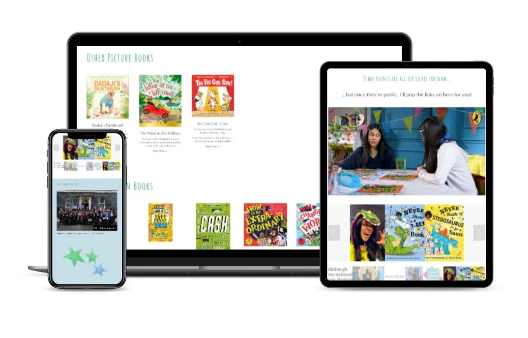
Example: children’s author Rashmi Sirdeshpande has a wonderful selection of fun photos and beautiful illustrations on her website:
And check out the mix of photos used by Chris Buchanan in her bio section, too.
4) Embed a (relevant) social media feed
As long as your social media content supports your overall brand, you can link or embed your profiles to show wider facets of your work. (Don’t just link to social media accounts for the sake of it, though - they need to be relevant to your main brand, and updated reasonably often. Otherwise, they’re clutter.)
Example: author Lēigh Tudor’s Instagram feed runs along the bottom of each web page:
5) Website copy should sound like you
The words you use should represent your personal style, ethos, and brand values. Don't use hip catch phrases, if you wouldn't in real life. But copy is a strong way to signal to “your people” that they’ve found a kindred spirit.
Testimonials and reviews also serve to underline what to expect. The language that others use to describe your work is especially powerful.
Example: see Lēigh Tudor’s website again, for the clear signals showing the sub-genre of her romance novels.
And my client Jean Zimmer included some fun “hidden” elements in her bio section, giving a better sense of her personality and what working with her will be like:
6) Video is a perfect way to show your personality
No need to go overboard and sign up for TikTok, unless you want to! One or two well-chosen videos work just fine.
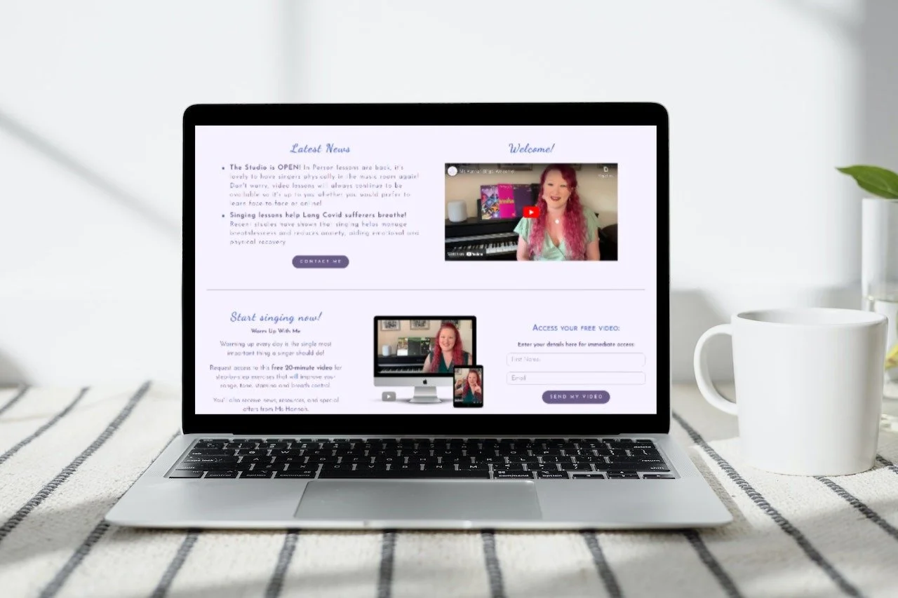
Example: Ms Hannah Sings is a singing teacher, offering lessons online and in-person. She has both a Welcome video, and a short video lesson as her lead magnet.
Hannah’s photos, illustrations, and website color scheme also reinforce her brand personality:
7) Use moving elements… but not too many
It's fine to have a few moving elements (gifs, scrolling text, moving backgrounds), but don't go overboard or you'll make your visitor seasick.
The eye is drawn to things that move, but, we’ve also learned to associate movement on websites with adverts, so keep it classy here!
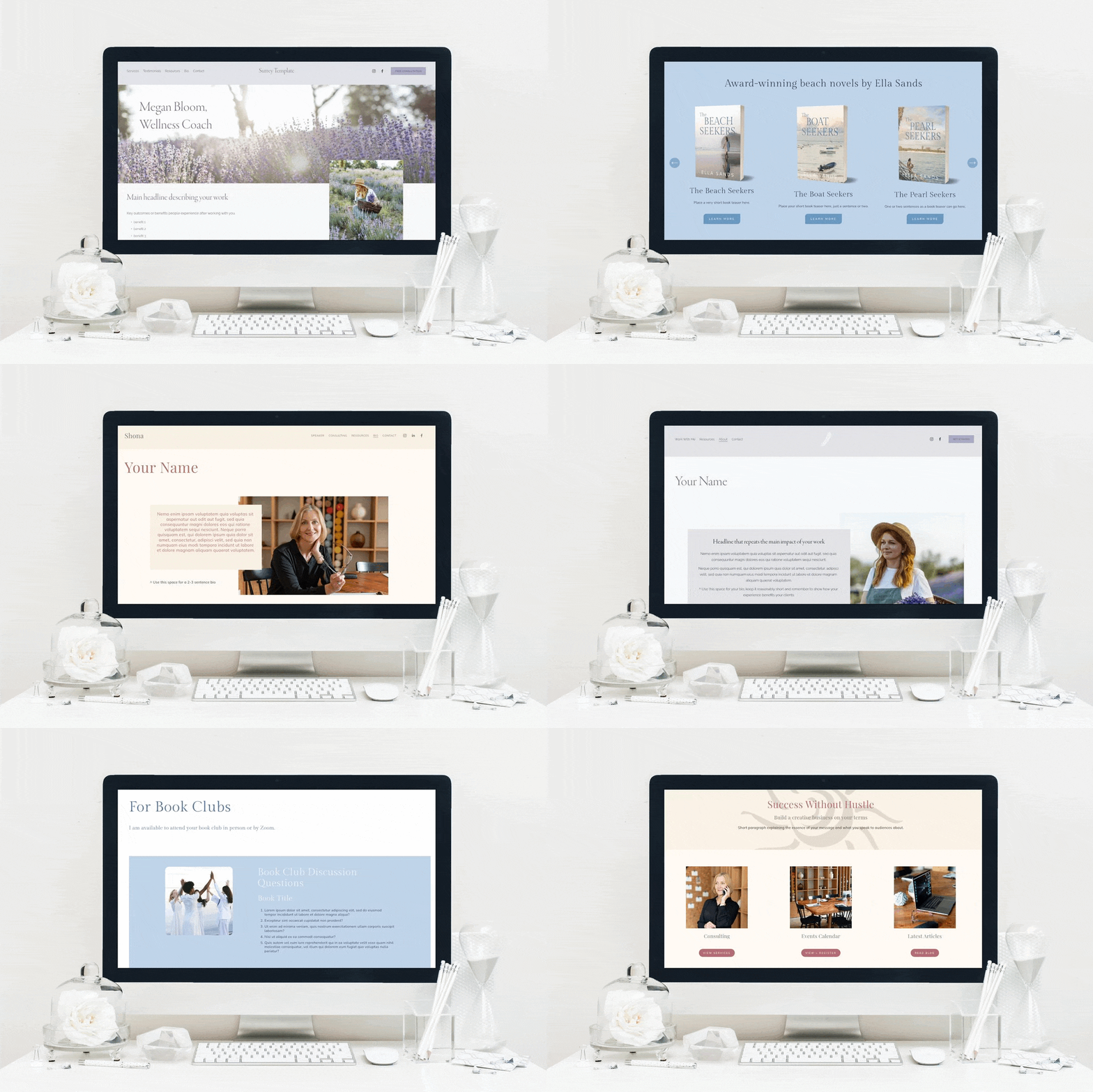
Example: I offer DIY Squarespace templates for purchase, and I use a changing graphic on the main page to give a sense of what’s available. You can also see small sections of moving text on my home page.
(How to achieve this? The graphic is simply a gif file, while the moving text needs a wee bit of custom CSS code behind the scenes in Squarespace.)
•
Would you like me to design and build your Squarespace author website?
As a professional specializing in author website design, I’m an expert in using just the right features to create a stunning and effective home for your work. If you’d like technical expertise, book marketing advice, and all of the implementation taken care of, consider hiring me.
After careful preparation together, I’ll design, build and launch your site in just 2 weeks. Learn more, and then schedule our free and friendly chat.
If you don’t yet have professional branding in place, I offer Brand Foundations as an add-on package.
Other resources for supercharging your author website
And for the essential steps in your website project, take a look at my free 50 Step Website Checklist.


