7 Ways Squarespace Helps You Stay Consistent
• This article contains affiliate links •
A strong website relies on consistency from page to page. Not only will your brand appear more cohesive and professional, but a design that doesn’t jump around all over the place will give a clear message and build trust with your reader.
Squarespace offers several thoughtful features to help you stay consistent in your website design. This obviously saves you time and stress, and you’ll end up with a better website that’s much more likely to get the business results you want.
Before you start
Unless otherwise mentioned, these features are available in Squarespace version 7.1 and on all pricing plans.
Save 10% off your first subscription of a Squarespace website by using the code PAULINE10
1) Set fonts with site styles
For your Squarespace website, you’ll choose a font for headings and one for paragraphs. These could both be the same, but most websites that I design use two.
You’ll set these fonts in Site Styles. If you’re a Squarespace beginner, know that you’re not limited to the suggested combinations, you can make your own combo.
Squarespace also offers you a third global font. It’s called Miscellaneous and by default it tends to show up for blog metadata and in product pages and other tags. However, I’ve also used it as a handy way to introduce a third font easily.
Website designers like me do have additional CSS tricks we can use to bring in extra fonts, or even to change font part way through a line of text. However, I love the Squarespace “soft” restriction of two or three fonts. Not only does it help your website design stay consistent, but your pages will load faster, too. You definitely don’t need custom fonts to have a terrific-looking website.
2) Choose your 5 main colors
Selecting your website colors is a fun part of the process, but it’s really important too. Squarespace asks you to choose five colors and, unless you’re a confident designer, I advise you to stick to those five. Your basic palette will likely include a very pale color, a very dark color, a light color, a dark color, and an accent color.
Related resource for purchase: Color Psychology for a Website That Works
Once you’ve specified these colors, again in your Site Styles panel, Squarespace will offer you this palette everywhere else that you need a color code. This is wonderful for staying consistent, and avoids the mistake I hate on DIY websites, where you’ve guessed at color shades and your brand “red” (or blue, or green) changes slightly from place to place.
3) Copy sections to different pages
This is a relatively recent feature in Squarespace and it’s been greeted with joy by the web designer community. A Squarespace page is made up of a number of different horizontal slices, or sections, and it’s now possible to create a section you love on one page, and then use it again on another page.
See here for full details on how to copy a Squarespace section to another page.
4) Use social icon blocks
If you are active on one or more social media platforms, you’ll want to link to these. Typically, you’ll include social icons on your Home page, About page, Contact page, and maybe in your website footer. Instead of having to make changes to all of those places, leading to potential inconsistency, Squarespace offers a Social Links Panel. Once you make an update there, your social links will be consistent wherever they show up on your website.
5) Incorporate Amazon blocks
(Requires the Squarespace Business price plan. Related: which Squarespace plan does an author need?)
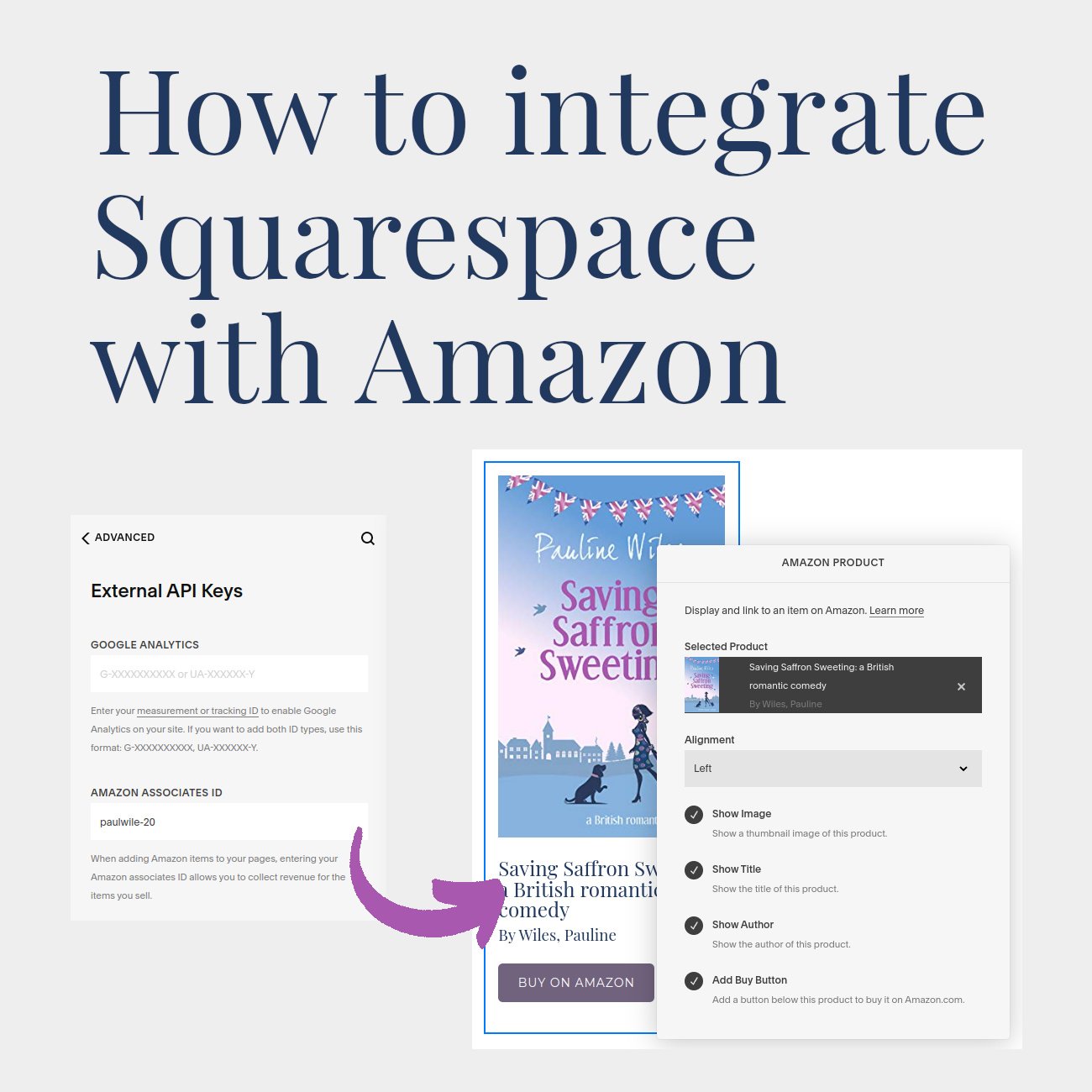
As an author, you might decide to show your books on your Squarespace website using the easy Amazon integration. I don’t recommend using Amazon blocks in every situation, but if you’re looking for simplicity and consistency, this is a strong feature and can potentially save you lots of design time. You can even specify your Amazon affiliate ID as part of your Squarespace settings.
Read my full guide to the Amazon - Squarespace integration here.
6) Check your website footer
I almost didn’t include this one, because it’s so obvious to me, but based on what I see on DIY websites, this needs saying. In Squarespace, you will design and configure your website footer, and then (unless you suppress it with custom CSS code), it will show up on every page.
Clearly, this is a consistency no-brainer! You can think carefully about the items that need to go in your footer, build it once, and you’re done.
I’ll write another article about what I put in most footers and why, but in short, you’ll probably want: your email list sign up form, a mini menu, social links, privacy policy link, relevant professional logos, and a copyright statement.
7) Use the asset library
A beginner mistake with Squarespace is to keep uploading the same image to your website multiple times. Imagine you’re an author of 5 books. You’ll likely want the image of your latest book cover on your website Home page. And since this book will have its own dedicated page, you’ll need the image there, too. And maybe you’ve got an overview page, showing all of your titles. So in it goes again. Finally, you’ll blog about your new release (several times), giving yet more pages where you load that image.
Squarespace offers you an Asset Library, so you can re-use your images (and videos). It’s a handy time saver and, once you’re happy with an image like a book cover, makes sure you stay consistent from page to page.
But where is consistency up to your web designer (or you)?
Squarespace is an excellent choice for creating your website, but it doesn’t do everything for you. There are some places where consistency, frankly, is your responsibility. And these nuances can take a while to learn.
One of the benefits of hiring a professional website designer like me is, I have an eagle eye for the overall quality and consistency of your website:
Image choices
The photos, graphics, and icons that you choose for your website need to be on brand and feel cohesive. Otherwise, your visitor gets a jarring experience, they’ll sense something is “off” and you'll undermine your professionalism. Look at the images on this page, for example, and you’ll notice they all have a related vibe.
Related: How to find website images
Copywriting consistency
Throughout your website, you need to pay attention to whether you’re using first or third person, consistency in the names of your services, capitalization, and “on brand” wording for your Calls to Action. That’s not to say that every button needs to have the same text, but if you write, for example, Complimentary Consultation on one button, and Yo! I Gotta Get This on another button, you’re undermining your brand.
URL changes
Let’s say you write your About page, and its address (URL) is /about. You link to this from other pages. But later, you decide your About page should be called Bio, and you change its URL to /bio. Unfortunately, Squarespace does not automatically update your internal links: it’s up to you, or your website designer, to get these details right.
Similarly, if you retire website pages, you or your website professional needs to make the effort to create page redirects, to avoid broken links and frustration for your website visitors. Learn more about how to set up Squarespace redirects, and why you should.
Conclusion
Squarespace is one of the best tools available to help you create a beautiful and professional website. While many authors and solopreneurs can make a “nice” website on their own, there are still places with a steep learning curve, and a hundred details to watch out for. If you prefer to be writing, or working with your own clients, it makes sense to stay in your zone of genius and hire an expert web designer like me.
•
Would you like me to design and build your Squarespace website?
Prefer not to spend your time and energy navigating design issues like this? Consistency, and attention to detail, is one of my superpowers!
As a professional specializing in strategic websites for authors and solopreneurs with books, I’m an expert in the features you need for a website that connects with your audience and gets business results. If you’d like niche expertise, top quality design, and your technical headaches solved, consider hiring me.
After careful preparation together, I’ll design, build and launch your site in just 2 weeks. Learn more, and then schedule a complimentary consultation.


