What to Put in Your Author Website Footer
• This article contains affiliate links •
If you’ve not given much thought to the footer area of your author website, you’re missing some useful opportunities to engage your audience and reassure them that you’re a professional who’s committed to quality work.
Your website footer will appear on every page, so use it strategically to make sure your readers and potential clients see information that helps you to help them.
And if a website visitor has scrolled all the way down the page so that they’re seeing your footer, this is a strong sign that they’re interested in what you have to offer!
Just getting started with Squarespace? Save 10% off your first subscription of a website by using the code PAULINE10
Here’s my quick list of what you can consider putting in your website footer. And below, I give more context and examples for each.
Author Website Footer Checklist
Your name or business name
Copyright year. Hint: just copy and paste this symbol in! ©
A short tagline, for branding or to help with SEO
Your geographic location, if you serve local clients
A sign up form to join your email list (remember to word the invitation for what’s in it for your readers)
Mini menu, so that people who’ve scrolled this far see their main options for where you’d like them to go next. You can create a simple menu with text, and link each item to the correct page on your website.
Social media icons (linked to your accounts: Squarespace makes it easy to update your accounts in one place, and then they’ll be correct, every time you show your links, anywhere on your site)
An integrated feed from one of your social media channels - for example, Instagram can be fun
Link to your privacy policy: not only do you look more professional, if you’re gathering email addresses, this policy is required in some countries
Link to your terms and conditions, if you offer services, and/or store policies, if you sell books and other products
A disclaimer for affiliate income. For example if you’re an Amazon Associate, this is required by Amazon.
A disclaimer if you work in a regulated industry, and need to make clear that your website does not give legal or medical advice
A values statement for your business, if this is important to you
Small logos: either your business logo, and/or professional credentials, as appropriate
A search bar, if you have extensive content on your website … although, in my view, the search feature in Squarespace isn’t brilliant. So test this, and see if you find the results helpful.
If your web pages are long, a button to allow for easy scrolling back to the top
It’s unlikely you’ll place all of these in your footer, but you should definitely consider your options, so you make smart and strategic choices.
How to choose what to put in your author website footer
There are three criteria for what goes in your website footer:
Does it serve or engage your audience?
Does it serve you? (Hint: in the long term, links and resources that serve your audience will also bring business benefits to you.)
Does it meet regulatory requirements, or make you look more professional?
Now, let’s look at some examples of website footers using these pieces.
Example Website Footers
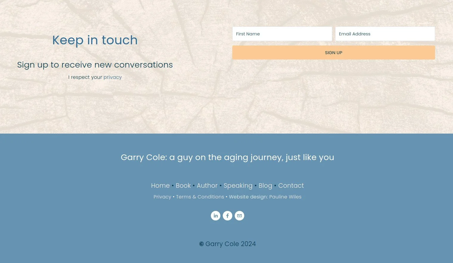
^ A comprehensive footer, with items 1, 2, 3, 5, 6, 7, 8, 9, 10. See it here
^ Items 1, 2, 3, 5, 6, 7, 9, 10. See it here
^ Items 1, 2, 3, 4, 6, 7, 9, 10, 14. See it here
^ Items 1, 2, 6, 7, 9, 11 feature in this simple footer. See it here
^ Items 1, 2, 3, 4, 5, 6, 7, 9, 16. See it here
^ Items 1, 2, 6, 12 in this simple footer. See it here
^ Items 1, 2, 5, 6, 9, 13, 14, 16. See it here
^ Items 1, 2, 5, 6, 7, 9, 10, 11, 15. See it here
Design tips for your author website footer
A darker background color typically helps to anchor the page; I would rarely use a lighter color for the footer, compared with the other page sections. But that’s not a hard and fast rule.
Always check your footer on a mobile device, especially a phone. Clever placement of items and alignment can look strange on a narrow screen. Increasingly, I’m choosing center alignment for footer elements. Be particularly careful that your footer items aren’t overlapping each other, and that there is enough space between them for a human finger to tap the correct link. More hints here on avoiding Squarespace beginner blunders!
The Squarespace Fluid Engine editor now gives easy control over image sizes on mobile. If you’re using logos in your footer, make sure their size looks appropriate on a phone, relative to the other elements.
•
Would you like me to design and build your Squarespace website?
Prefer not to spend your time and energy navigating design issues like this? As a professional specializing in strategic websites for authors and solopreneurs with books, I’m an expert in the features you need for a website that connects with your audience and gets business results. If you’d like niche expertise, top quality design, and your technical headaches solved, consider hiring me.
After careful preparation together, I’ll design, build and launch your site in just 2 weeks. Learn more, and then schedule a friendly Intro Call.
Other resources for designing your author website in Squarespace
Save 10% off your first subscription of a website by using the code PAULINE10


