What Does a Strong DIY Website Look Like?
• This article contains affiliate links •
Today, let’s celebrate the achievements of the wonderful group of students who planned, designed, built, and launched their new Squarespace website during the first cohort of my group program, Website With Friends.
Not only did this talented group of authors and educators see their own website go from concept to completion in 3 weeks, but they provided exceptional support and community for each other, too.
It’s important to be realistic when you build a website on your own, especially if it’s your first attempt.
Like most things in life, you won’t be able to make something as extensive, or as polished, as if you hire someone like me to do it for you.
Nonetheless, I’m enormously proud of what everyone in the group achieved. They all took on board my encouragement to keep it simple, and to launch an attractive, basic site with the intention of adding to it later, if appropriate.
Their websites are well designed, easy to navigate, and uncluttered, with clear Calls to Action for the next step.
Let’s take a look at what they made!
Mary E. Scott, author
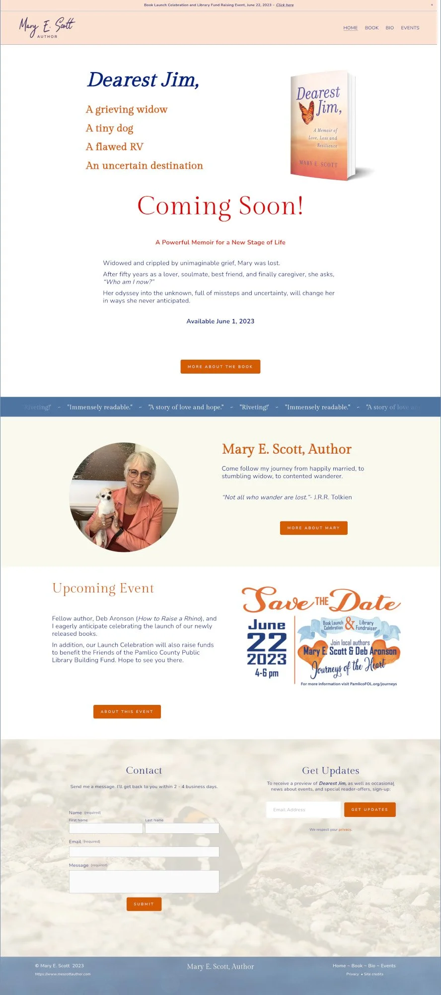
Mary’s memoir, Dearest Jim, releases soon, and she rightly decided this was the ideal time to create an author website.
Includes: Home, Book, Bio, Events, Contact form, Email list signup
Platform: Squarespace
What’s working well here:
Mary has a strong book cover and she stuck closely to a color palette inspired by this.
She carried through the butterfly theme, too, in her website footer and favicon.
The overall design is crisp, modern, and appealing.
The book page includes praise from early reviewers, plus photos from events in the narrative.
Mary included a beautiful graphic and fundraising information for her book launch celebration, hosted jointly with another local author.
Susan Tenon, educator & writer
Susan Tenon is an advocate for teachers, students, and public education. After seeing traction with her biweekly conversations with colleagues, she decided to take Collaborative Conversations online to grow the discussion.
Includes: Home, Blog, About, Contact form, Email list signup
Platform: Squarespace
What’s working well here:
Susan was realistic about the demands of her day job alongside building and launching the website, so she restricted herself to a few key pages first.
Nonetheless, the initial blog articles give a good sense of what her work, and the website, are about.
She stayed away from educational clichés for her images, and instead used a beautiful banner photo that’s local to her.
There’s a tempting coupon code in the announcement bar at the top of the website.
Avoiding the pressure to try to be “everywhere” on social media, Susan’s linking only to Twitter, the platform that works best for her.
John McCluskey, author
John McCluskey is an author and photographer who has been widely published in numerous literary journals and anthologies in the US, India, and Australia.
Recognizing the need to have a website to serve as a central place for readers to find him, John created the site to show his literary fiction and poetry.
Includes: Home, Books, News, About, Contact
Platform: Squarespace
What’s working well here:
John showcases his three published books on the home page of his site.
The website’s color scheme is inspired by the mood of the covers, without trying to copy them exactly.
John is an accomplished photographer, and he used his own work for background texture graphics and other visual details.
Praise for his books is featured in a scrolling text bar, near the top of the home page.
John likes to interact with readers on Goodreads, and he’s using the announcement bar at the top of the website to promote a current giveaway there.
Nina Paul, author and Reiki practitioner
As the author of three books under the famous “Dummies” umbrella, Nina’s credentials are clear. She wanted her website to strike the balance between her strong scientific background, and her current work on topics of consciousness, the immune system, and states of being.
Includes: Home, Books, Bio, Contact
Platform: Squarespace
What’s working well here:
Nina did a wonderful job of letting her love for the natural world shine through on her website. The background images she chose make a strong, upbeat statement.
The brand colors of the Dummies books are tough to work with. Nina navigated a harmonious color scheme to great effect. In my view, the black, vivid green, and yellow Dummies shades would have been too harsh for an entire website.
I’m showing both the home page and books page here, to illustrate how these elements are co-existing.
Instead of trying to include all of her writing, editing and Reiki healing services on the website at this stage, Nina intends to add to the site over time.
Advice from them to you
The timeline for this group program was a brisk 3 weeks, taking each person from content gathering to a published website in that time.
Afterward, I asked my students what advice they would give to someone thinking of building a website themselves. They said:
“I was lukewarm initially on whether I needed a website for my literary career. This program introduced me to a high level of professionalism regarding the appearance and functionality of a website tailored specifically to my writing style.”
“I immediately saw a much more interesting and polished representations of my work that rekindled my enthusiasm for self representation.”
“Have the time set aside to work on it a lot. I feel relieved and proud now the website is published, but also… the work is just beginning because now I have to fine tune, update, and figure out email campaigns.”
“Building the website was far more complex than anticipated… I also wish it had been suggested how important the pre-work was before jumping in. Now the website is published, everyone who has seen it is impressed.”
“Be clear what you want - gather at least some of the photos, books, articles, links, content so you can focus on putting that into place.”
“Be willing to publish a few most-needed pages within the 3 weeks. You can then get it published, with room and knowledge for later additions. Having the focus of a short time period actually helped it come together!”
If you’d like to be notified when the next cohort of Website With Friends opens for enrollment, sign up here.
Advice from me to you
Watching this group embark on their website project and emerge victorious on the other side was both rewarding and fascinating for me. I learned a lot about how others approach the process, and I certainly saw places where my explanations could have been clearer.
It also served as a clear reminder that:
There are a lot of skills involved in creating an attractive, functional website that gets results.
I’ve spent a long time (20+ years) getting good at this. There’s masses I know about design, marketing, technology, and Squarespace in particular, that can’t be taught in a matter of weeks.
Few people have the aptitude, tenacity, and enthusiasm to create a strong DIY website entirely on their own.
Depending on the structure of your business and your income streams, it may make better sense to hire a professional to do it for you, so you can get on with work you love, that you’re actually good at.
Especially if you’re a nonfiction author whose book is a promotional tool for your main business services, or if you’re a professional speaker who sells high end services from the stage, you’ll get a return on your investment from hiring me to create a strategic website on your behalf.
•
Would you like me to design and build your Squarespace author or speaker website?
The students in this group program did an excellent job of creating their websites under my guidance. You can also check out what a website designed and built entirely be me looks like, here.
For your website project, if you’d like strategic advice, technical expertise, professional design, and all of the implementation taken care of, consider hiring me.
After careful preparation together, I’ll design, build and launch your site in just 2-3 weeks. Learn more, and then schedule our free and friendly chat.
Other resources for supercharging your author or speaker website
And for the essential steps in your website project, take a look at my free 50 Step Website Checklist.


