Top 10 Squarespace Features for Speakers
• This article contains affiliate links •
To get booked to speak on stages, or as a podcast guest, your website needs to look professional when an event organizer or podcast host checks you out. And they will! There’s no point working hard to build your network, earn referrals, and pitch yourself, if you show up as dated or irrelevant, as soon as someone Googles your name.
Some of the best modern speaker websites are built using Squarespace: it’s a platform that enables designers like me to create beautiful websites that look amazing, but where you can also make simple updates and edits yourself.
Here are my 10 favorite Squarespace features that, as a public speaker, you should know about. Either incorporate these into your website, or ask your website designer how to make strategic use of these.
Save 10% off your first subscription of a Squarespace website by using code PAULINE10
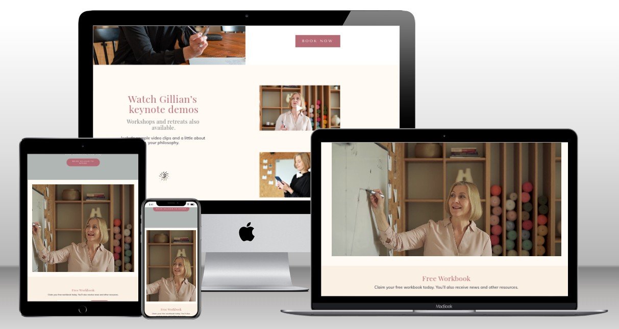
^ Video options on your Squarespace pages
1. Video blocks and backgrounds
Squarespace gives excellent choices for how to use video in your website. If you’re just getting started as a speaker, you’ll want to embed at least a few video clips of you talking about your topic, ideally in front of a live audience.
All Squarespace plans allow you to host up to 30 minutes of video, so for a short highlight reel, you don’t have to pay for separate hosting. Personally, I use this quota for the most important videos on key pages of my website. Then, if I’m explaining a technique as a “how to” in a blog post, I might embed a YouTube video for these secondary pieces.
And once you’re established as a speaker, you’ll likely want a banner video (repeating on a short loop) near the top of your Home Page. Setting the video as the background of that large top section creates a compelling, modern effect, and proves to event organizers that you can walk your talk.
Pro tip: if you want to use the same video clip more than once on your website, don’t upload it a second time. Instead, choose Select From Library, and you won’t waste your Squarespace video storage allowance.
2. Logo walls
You’ll definitely want to show your speaker credentials by highlighting the organizations (or media outlets) where you’ve spoken.
Talk to your Squarespace website developer to see whether individual images, or a Gallery block, will work best for your needs. Whichever approach you choose, check the mobile view to make sure the logo sizes are still appropriate.
For example, here are the logos I display, showing where my clients and I have been featured:
3. Contact information in strategic locations
Make it easy for event organizers to contact you by offering a variety of methods. Squarespace makes it simple to add a Call To Action button in the header of your website, so you might link that to your contact information.
However, since people who book speakers are often working in a hurry, I recommend you add your phone number near the top of your Home Page, too.
Alongside these methods, you can offer a contact form if there are essential questions you want to ask for every inquiry. Squarespace makes it easy to set this up, and to customize the questions you ask.
And you should repeat your preferred contact details in your website footer. That way, they’ll appear on every page, and this is an obvious place where an event planner will look.
4. Media kit
The website page for your media kit needs to be designed strategically, so it offers the information that hosts and organizers need, to get you booked for the type of speaking you want. Don’t make them wade through clips of everywhere you’ve appeared, but do provide enough “social proof” to show you know your stuff.
This page will also offer your headshot(s), and you can configure this so the size of image online is suitable for a website (= it loads fast), but with a high resolution file behind that, so the event planner can click to download, if they need print quality.
Here, you’ll also place your Speaker One Sheet (see below), and other material such as your bio, and a suggested introduction for a live or virtual appearance.
5. Speaker One Sheet
Don’t keep your Speaker One Sheet under wraps: make it available as a download on your website. See these instructions for how to upload a PDF to Squarespace.
And if you need a new Speaker One Sheet, I offer free templates for you to make your own, using Canva.
6. Booking forms
You can eliminate much of the back-and-forth for logistics around your speaking event by including forms on your website for an event organizer to complete.
These forms can be placed on pages that are not in your main navigation, and you can hide them from search engines if you prefer. Then, just send the direct link to event organizers who need it.
This is yet another way to demonstrate your professionalism, and be easy to work with. Not only does this save your time, but if the event organizer has a smooth experience, it makes it more likely they will refer you for other speaking opportunities.
Related reading: 15 Ways Your Website Can Save Your Time and Sanity
7. Calendar integration
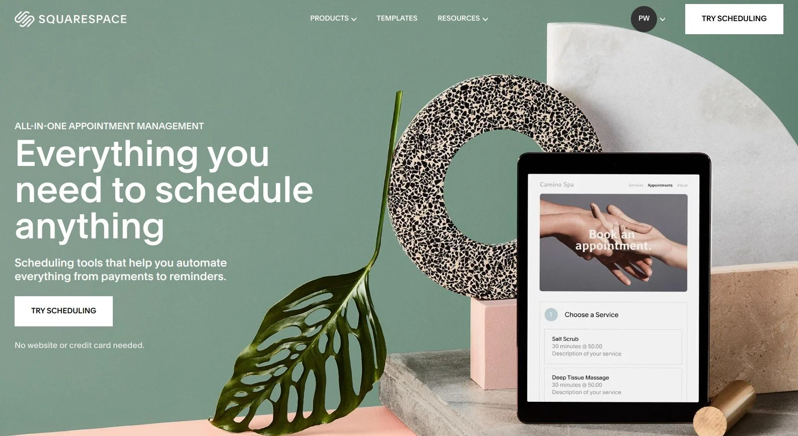
If consulting or coaching is part of your speaking business, you may want to offer a discovery call or initial consultation to prospective clients. Squarespace owns Acuity Scheduling, and offers easy, powerful options for appointment booking, payments, notifications, packages, and intake forms.
8. Blog posts or Podcast show notes
Are you building your authority and growing your audience with a blog or podcast? Squarespace makes it easy to publish both blog articles and podcast show notes, and it has built-in SEO tools to help you get discovered.
The Squarespace blogging feature needs little introduction. As you might expect, you can create articles, share them on social media, categorize them to help your audience discover relevant resources, and so on.
For your podcast episodes and/or show notes, you have two convenient choices.
Squarespace makes it easy to create and manage podcast episodes. To do this, you’ll actually start a second blog as part of your website. Add a new “Collection”, choose the blog collection type, but then rename it to represent your podcast. Configure the other settings too, as described here, before posting your first episode by adding an audio block to your page. From there, you can submit your podcast to Apple Podcasts.
Or, simply add your podcast show notes as part of your main blog, and categorize them so you can show them all on dedicated page. This option makes sense if you’re hosting your podcast elsewhere, but you’d like to publish information about each episode on your website.
9. Flexibility as your business grows
Thinking of publishing a book? Starting an online membership? Adding additional consulting services or team members? Squarespace is extremely flexible for adding new features when your business grows or pivots. Unlike WordPress, where your initial choice of theme can limit your options, Squarespace allows you to add and remove pages, reorganize your website menu, and update both your content and calls to action.
In the event that you retire a page or need to move content around, setting up page redirects (often known as 301 or 302 redirects) is a piece of cake in Squarespace. This means your visitors won’t find broken pages if they follow existing links.
And handy integrations, like the ability to feature Amazon products and earn affiliate commission, gives you additional income streams when it makes sense for you.
10. Peace of mind (updates and security patches) included
If your website uses WordPress, someone needs to take care of it. In theory, that could be you, but more likely, you’ll end up paying retainer fees to a WordPress expert who will make sure your website is backed up, updated with software releases, and — crucially — patched for emerging security vulnerabilities. Otherwise, the unpleasant truth is: you run a high risk of getting hacked.
With Squarespace, this vital maintenance is all included in your monthly site subscription. If I design and build your initial Squarespace website for you, you won’t pay me a penny in ongoing retainer fees. And best of all, there is a 24 x 7 support team at Squarespace who will assist you, free of charge, if you have website questions or need help.
•
Would you like me to design and build your Squarespace speaker website?
I’m not only a professional website designer: I also speak internationally to promote my services. This means I’m an expert in using all of the above features to create a strategic website that brings a big return on your investment. If you’d like technical expertise, marketing strategy, and all of the implementation taken care of, consider hiring me.
After careful preparation together, I’ll design, build and launch your site in just 2 weeks. Learn more, and then schedule our free and friendly chat.
Other resources for supercharging your speaker website
When you work with me, you’ll save 20% off your first year with Squarespace. Or, if you build your website on your own, you can still save 10% with code PAULINE10 .
And don’t forget to access my 5 free Speaker One Sheet templates for Canva.


